Appearance
In the appearance menu, you can get access to 5 of the following settings as below.
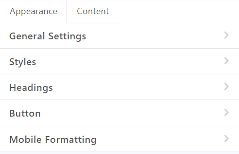
General Settings
- Message Width: Message width is in 600px by default. You can modify the size between 320px and 900px.

- Default Padding: Used by default for all new structures added to email from the Content tab or while adding new (Styles) row.
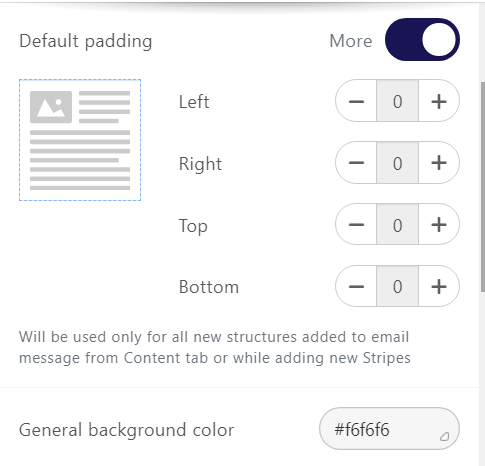
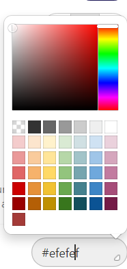
- General Background Color: You can pick your favorite color to be set on background from ready colors or paste your color code in the box below.
- Font: Pick the basic Font for the whole email.
- Line Spacing: Set the default line spacing for all text elements of the email.
- Paragraph bottom space: Your email design might look clean if you on the bottom space.
- Underline Links: Enable the Underline links control is recommended.
- Responsive Design: Enabling the responsive design option may help to improve the mobile display. However, results may vary depending on the device. If you disable this control, the mobile version of your email message will look the same as the desktop version.
- RTL text direction: If this control is activated then text direction will automatically go from left to right.

Styles
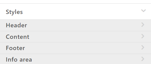
Header, Content, Footer, or Info Area are defining each row of the email template. You can click each one of them and set its value base on your needs.
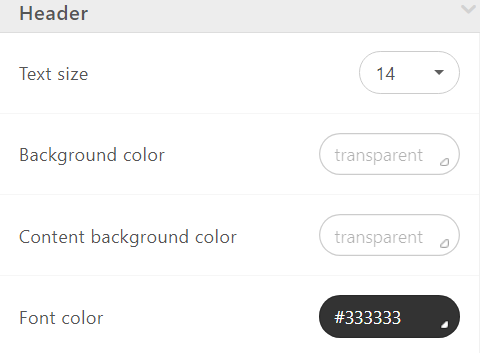
You can set Text Size, Paragraph Bottom Space, Bottom Space, Background Color, Content Background Color, Font Color, and Link Color and Background Image.
Headings
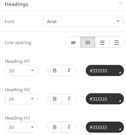
For H1, H2, and H3 headings, you can set the default font style, size, color, bold, and italics fonts here.

Button
You can set some parameters in the Button menu that will be used by default for all buttons in the email.
- Highlight Hovered Buttons: Click this option if you wish to highlight hovered buttons.

Once you click you will come up with two buttons which are “Highlighted Button Color” & “Highlighted Text Color” and you can pick the colors.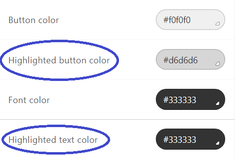
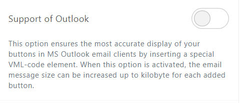
- Support of Outlook: This option allows improving buttons displaying in Outlook, by inserting a special VML-code element.
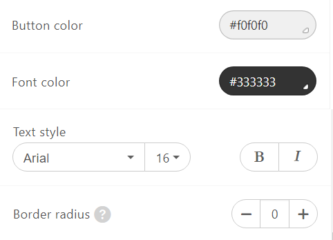
You can change the Button Color, Font Color, the Text Style and Size, the Thickness and Italics parameters, as well as the border-radius. - Button Color: Change the button color
- Font Color: Change the font color inside the button.
- Text Style: Change text style inside the button.
- Border Radius: Increase or maintain the border.
If the Border control activated, you’ll be able to change the radius of each side of the button.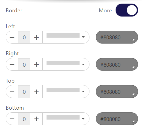
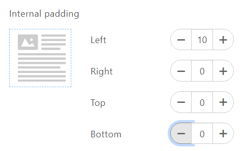
- Internal Padding: You can set the internal padding for buttons, independently for each side from this section.
Mobile Formatting
Here you can control how your email will look on mobile devices.
You can set Size of Header text, Size of the Content text, Size of Footer text, Size of Info area text, the Text size of the items for the «Menu» block, Text size for headers H1, H2, H3, set Horizontal alignment and Email Content Margin for them.
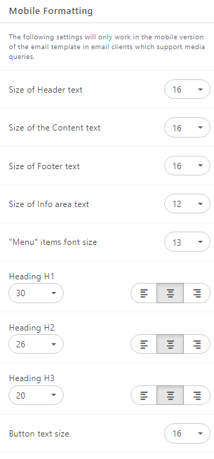
Set the text size for the buttons to be the full width of the mobile device.
Start With FloppyEmail Now!